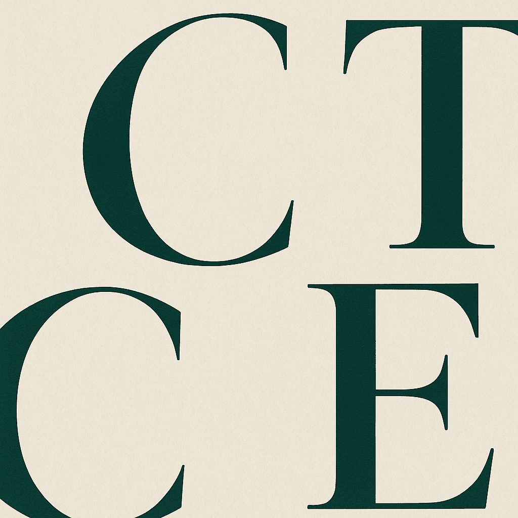
Typography is the voice of a product. Before anyone reads a word, the type has already set a tone: confident or timid, warm or clinical, modern or nostalgic.
A good type system is mostly about rhythm: a clear scale, generous line height for body copy, and consistent spacing. Get the rhythm right and everything feels intentional.
You rarely need more than two families. One for expression, one for clarity. The restraint is the point.
#Typography#Design#Systems